
Well that’s finally finished, and what a birthday week it was. It feels slightly indulgent to take up so much blog space with something so silly, but then again, are 400th birthdays silly? They only come around once, after all!
I hope you enjoyed reading some of these reflections on the sonnets but more importantly, I hope you felt inspired to pick up an edition to peruse on your own, at your own pace, in the little nooks and crannies of your day.
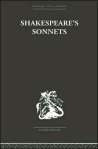
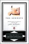
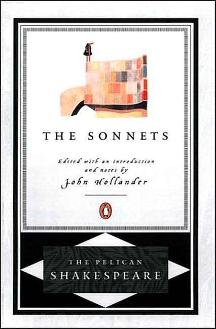
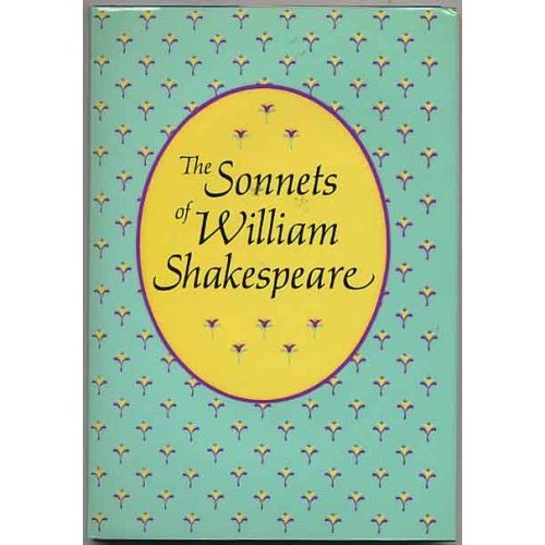
In that spirit, I thought it would be fun to collect a select few images of the many thousands of editions that have been printed since 1609. Keep on the lookout for the one that grabs your eye.
“But thy eternal summer shall not fade.”
-

- How cute is that? From the amazing Lilliput Press in Bristol.

-
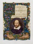
- The one-of-a-kind Alberto Sangorski edition, which according to the Washington Post, is “clad in leather and studded with sapphires and 18-carat gold.”
-

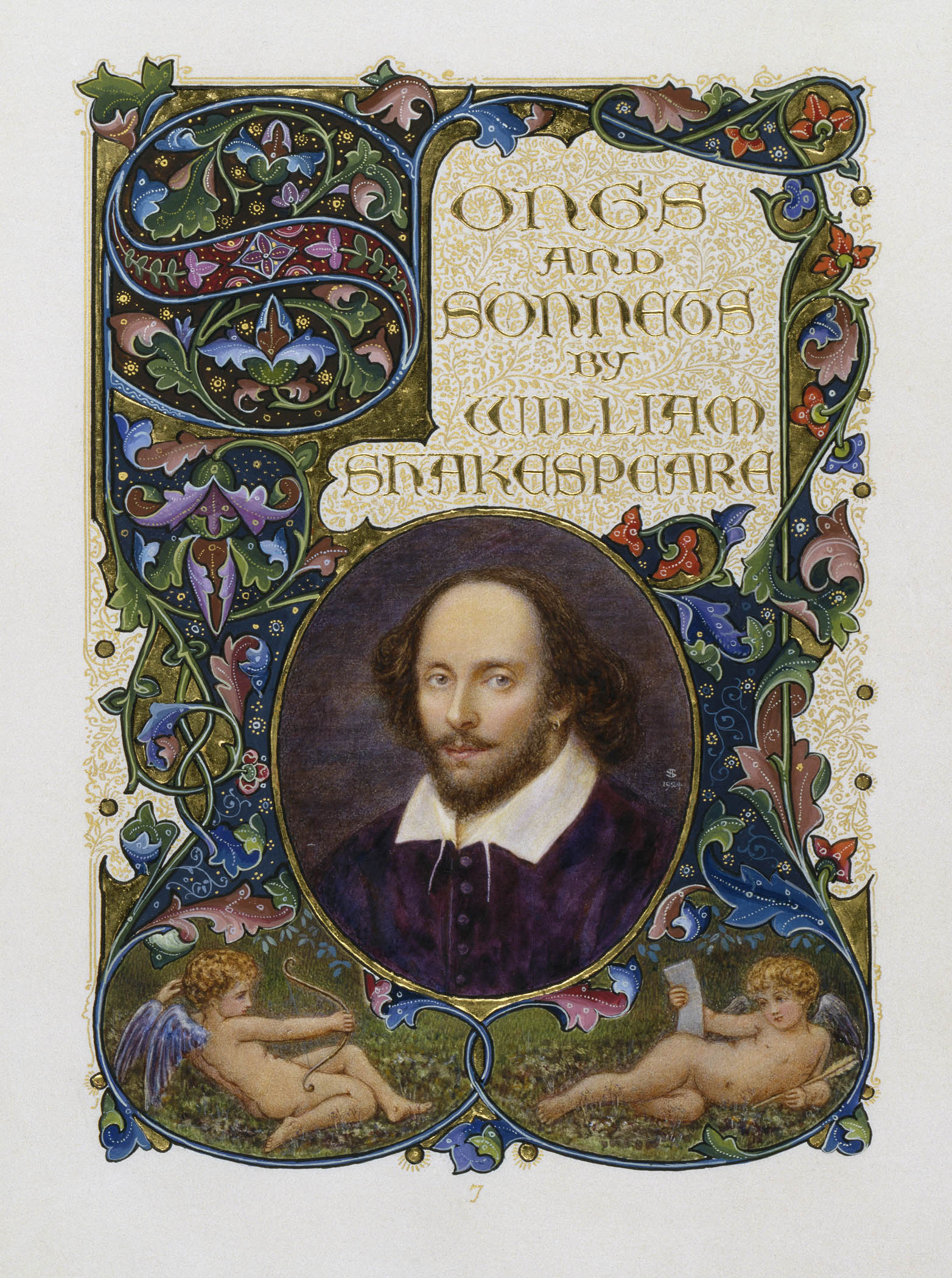
- Red leather always helps, especially with the unique author image.

-

- I’ve almost bought this gorgeous thing about eight times now but it’s always a bit too pricey.
-

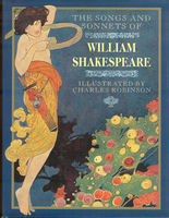
- As usual, this illustrator hits the themes a little too on-the-nose (cuddling in the park, for reals?) but I like the “vintage paperback sold from a guy outside on 6th Ave” quality.
-

- Aww, yeah Shakespeare!

-

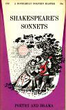
- Classic, tried-and-true. The vintage orange Penguin look is the only one of the “boring” editions I approve of.

-
- If anyone can tell me what the heck this is I’ll buy you a donut.

-

- Not sure what’s going on here, but that guy missed a few buttons this morning.

-
- Another beautiful yet modern Penguin edition. Of the widely available in-print editions, this is the best-looking.
-

- This has a certain sans serif early ’80s snobbery feel that reminds me of every volume on my hippie mother’s bookshelves when we were kids.

-

- Sometimes book designers did abstract things in the ’60s, and we get to reap the benefits.
-

- There are many text-only cover treatments but this one has a thoughtfulness and elegance that’s rare.

-

- I love this French edition for going with a more meaningful cover image. It may seem incongruous at first but I think the quiet country farmhouse captures some of the nostalgia in the poems better than any couple making out on a park bench could.

-

- Though it’s of the awful “Shakespeare’s face and book title” variety, this German edition at least pulls it off with solid design.

-

- Almost like a treasury of nursery rhymes, this simple edition feels accessible and welcoming.
-

- It’s just a fact that the rare and antiquarian ones are the best. The green background feels austere and the red filtered image adds something complimentary and individual.

-

- Nothing special about this one other than that it’s the one I’ve carried around in bags and back pockets for ten years, beaten to shreds with pieces of the cover chipping off every time I open it. I hope you all have one just like it.


Leave a comment
Comments feed for this article